
A learning process begins in our brains every time we visit a new website. Whether it’s navigation, design, or another website element, the brain has to learn how to use the site without forgetting why we visited it in the first place.
The mental effort required during this time is called cognitive load. Remember also that the working memory in which this new information is processed and stored is limited. The brain begins to slow down or even give up on tasks when it receives more information than it can process simultaneously. Although cognitive load is not entirely avoidable, designers must strive to manage and adapt to these limits.
What is cognitive load?
To reduce cognitive load, we must first understand what causes it. Broadly speaking, the causes of cognitive load can be traced back to three main factors:
- Too many options
- Too much reflection needed
- Lack of clarity
Each of these factors requires its own effort and consumes mental resources that do not really help users understand the content.
Miller’s Law
Miller’s Law states that a human being can only retain between 5 and 9 items of knowledge at a time. As a result of this principle, many misunderstandings have arisen, such as the restriction of an interface menu to 7 items. It is better interpreted as an argument that the number of objects that the average human can hold in short-term memory is 7 ± 2.
Hick’s law
Hick’s Law (also known as the Hick-Hyman Law) is a psychological principle that examines the relationship between the number of options and the time it takes to make a decision. Simply put, the more options there are, the longer it takes to make a decision. Therefore, as designers, we must integrate the data and display it in a way that is not overwhelming for the user, seeking clarity.
Our UX/UI Suggestions
These two laws can be summarized in three tips that help reduce the cognitive load:
Groups
To make the information easier to process and memorize, we can divide it into a small number of units or chunks. Fragmentation allows us to compensate for our limited ability to process and store information in short-term memory. An example of how we fragment information can be the way we display spaces in a phone number:
![]()
(this is the Making Science US office number,
call us if you need further UX/UI assistance 😉)
We recommend breaking down large amounts of info into smaller pieces so that the user can understand it and get a clearer idea of what is going on. The user’s perspective on what is important and worth remembering may depend on how the information is regrouped.
Categorization
Organizing information into logical groupings is another way to decrease cognitive load. Grouping items divided into various categories can help users focus more effectively. This helps prevent cognitive overload by reducing the amount of material the user is exposed to. In this way, the user can concentrate on the group that interests him and ignore the rest of the elements.

Limit the number of options
As we have already seen in Hick’s law, the difficulty for the user to make decisions is directly proportional to the number of options he encounters. The easiest way to fix this would be to narrow down the options where possible. A user presented with a decision between 3 or 4 elements will (almost) always have a better conversion rate than one with 6 or 7.
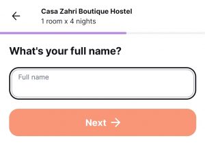
When this is not possible, we can adopt the above advice and group or categorize. For example, if a form has too many fields, we can divide it into steps to discourage abandonment.
One last UX/UI consideration
Here we present you with 3 ways to improve the user experience on your website. HOWEVER!! You should remember that these are general recommendations. All people, industries, and websites are a little bit different. Generalities will only get you so far when it comes to creating an incredible onsite experience.
As such, we highly recommend integrating testing and experimentation into your UX/UI plan. We usually recommend giving a user only 3-4 choices at a time – but testing master Netflix throws 30 different choices at a user at once. Why? Because they surely tested it and realized that when items are categorized, it doesn’t matter that there are 30 options on the screen at once.
💡Learn more about testing, experimentation, and Conversion Rate Optimization in a recent blog post here.
Conclusion
By following these principles, you can greatly reduce the user’s cognitive load and ensure that their attention is not wasted on things that aren’t helpful to them. Always remember that the user came to your website with a goal, whether it is to buy a product, understand something, or simply learn more about the content on the web. Help them find what they are looking for!
If you want to get started but aren’t sure how, let us know by clicking the button below.


 Cookie configuration