
The Surprising Reality of Mobile Web Accessibility
One might think that it’s a battle won. Web accessibility has been a resonating theme for over two decades now, emphasizing the importance of ensuring an inclusive online experience for all users.
65% of web traffic in Europe comes from mobile devices, and Google has clearly indicated its support for mobile-optimized websites by favoring them in its ranking.
Mobile Optimization: Expectation vs. Reality
Nowadays, all advertisers should have a mobile-optimized website that adheres to the basics of accessibility – how could it be otherwise?
However, despite advancements, the reality is quite different. A study conducted by Making Science in 2022 shows that, among other findings, 72% of the websites of the companies from the IBEX 35 (Spain’s principal stock exchange), exhibit mobile accessibility deficiencies.
Similarly, we still encounter clients asking us to audit their website, only to find that the design was not initially intended for mobile.
This is particularly serious because not optimizing the experience for the majority of traffic exposes one to losing conversion points, leads, and sales.
Responsive Design vs. Mobile First.
Moreover, just because a website displays decently on a mobile device doesn’t mean it’s optimized for the best conversion. To explain, the term “responsive” is not equivalent to “Mobile First.”
When designing a website, there are generally 2 or 3 versions for different device types: Desktop, Mobile, and sometimes Tablet. There are fundamentally two ways to work: either start with mobile and progress to larger formats, known as “Mobile First”, or the other way around. This first approach makes the most sense since it caters to the majority of users, leveraging additional space on desktop.
The other approach, unfortunately still too common, goes in the opposite direction, known as “Graceful Degradation.” The designer starts with the largest version and then adapts it to mobile. This is not the right approach as it optimizes work for a minority, requiring adjustments for content and functionality in a confined space.
You might say, “But if we’re talking about ‘Graceful Degradation,’ it can’t be that bad.” Let me give you an example to explain why it’s not the case.
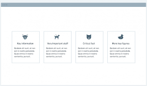
Imagine a product website presenting its main selling points to visitors. On the desktop version, a common way to present them would be using elements called “Cards,” with 3 or 4 cards in a row. This layout is suitable for a large horizontal screen but we can immediately intuit that it doesn’t fit very well into a vertical screen.
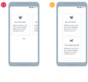
 When translated to mobile, these cards often end up either in a horizontal carousel or a simple vertical stack, neither of which is optimal. In the first case, the user will have to interrupt his horizontal scroll to scroll horizontally in order to see the info. (Spoiler: he won’t do so, and will lose an important part of the product pitch.)
Vertical stacking is a better option, but in terms of design and space optimization, it’s really not that great.
 The Case for Progressive Enhancement
 The Case for Progressive Enhancement
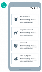
Working in the direction of “Progressive Enhancement,” starting with mobile, forces us to optimize information presentation for mobile constraints, resulting in a better-adapted version.
Here, all information is visible on a single screen, giving the user access to all arguments in a nutshell.
The errors caused by the Desktop First approach can be even more dramatic and lead to significant drops in conversion. For example, forgetting to provide a mobile user with a link to return to the filtered list from a product page because the Desktop version lacks it (desktop users are generally relying on the browser’s back button).
Breaking Free from Old Design Habits
Unfortunately, many agencies and designers still follow a Desktop First approach, either out of habit or comfort. It’s more rewarding to design a beautiful layout on a large screen than starting with mobile. Another downside is that since mobile design comes at the end of the creation process, it often gets rushed to meet deadlines.
It’s time for agencies and designers to break free from old habits and prioritize the quality of the user experience across all platforms.
Advertisers must also ensure that teams responsible for designing digital assets opt for a “Progressive Enhancement” approach, starting with mobile. This represents a strategic approach to overcome constraints while ensuring a consistent and optimal user experience.
The journey towards universal web accessibility and an exceptional user experience requires constant evolution of methodologies and a reassessment of established practices. Only those who anticipate these changes and adopt innovative approaches can hope to stay in sync with the growing expectations of users.


 Cookie configuration