

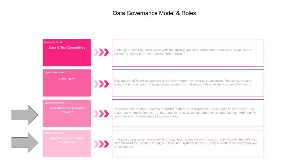
 The BigQuery Intelligence tool was built to help the data warehouse/lake architects/administrators/custodians manage house-keeping activities regarding datasets, tables and views and optimize these same objects. Many of our larger and very large customers have 100’s of datasets and 100’s of tables and 100’s of views within each dataset making it very challenging to keep on-top of house-keeping activities. BigQuery offers data lake administrators a simple visual interface to list datasets, tables and views. The BigQuery explorer panel interface allows you to collapse tables and views under their given dataset simplifying the visualization.
  But the BigQuery Explorer does not offer data lake administrators a simple visual interface to understand usage statistics regarding datasets, tables and views; this is where BigQuery intelligence collects underlying data previously collected by the GCP + BigQuery environment and offers visualizations to understand the usage patterns across the nodes in the data warehouse. The Data Scientists and Data Engineers at Making Science had a look and determined that a tremendous amount of data lake usage statistics are available in GCP but missing an easy means to retrieve the data and visualize the usage patterns in the data lake. The team decided to apply Sankey visualizations built using Python and D3 to the problem to facilitate understanding the usage patterns between the nodes (datasets, tables, views and jobs/queries) in the data warehouse.
 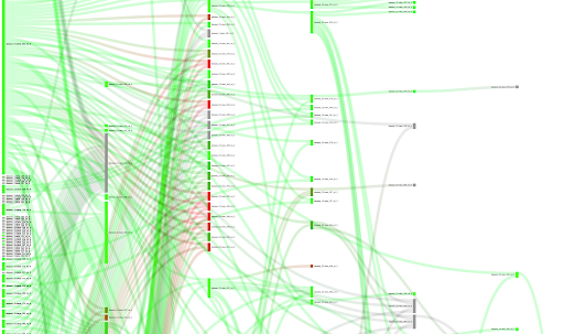 As the team worked with some very large data lakes they quickly found it necessary to allow data custodians to apply filters to limit views of the data lake to make the Sankey diagram more readable. Most typically they would select logical groupings of datasets to give a complete view but without making the visualization undecipherable. BigQuery Intelligence actually allows filtering both on datasets and tables.
 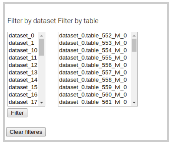 The team also found that by including the possibility to define color based on criteria; by default, the color criteria is “dataset” so that each dataset is distinguished by a specific color in the Sankey visualization.
 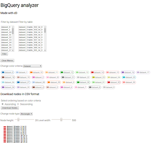 The team decided to include a “change color criteria” filter, where we can choose between additional criteria including: bytes, jobs, inherited jobs, recency and inherited recency. With this kind of plot, we can check if there exist inefficient nodes in the data lake.
HotSpots
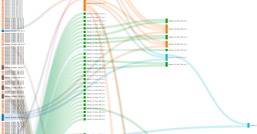
A couple of use cases helped by changing the color criteria is the location of “hot spots”, i.e. those nodes which process too many bytes or have too many jobs, and “cold spots” or those nodes that have not been used in a long time and hence could be be removed/deleted from the data lake. In the following screenshot we can see that the color indicates the volume of data each node has processed. Red indicates too much, and green indicates a reasonable volume. Grey indicates that we don’t have information about this particular node. It is interesting to see nodes that have a deep level and are very red. This usually means that those nodes could be optimized by creating aggregated/intermediate tables.
Unused nodes
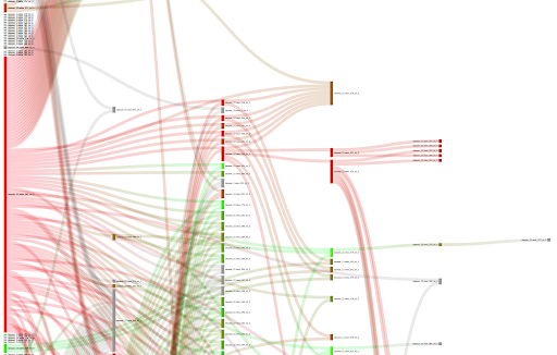
If we change the color criteria to “inherited recency”, we can search for nodes that have not received any query/job in a long time. The meaning of “inherited” is that we take the smallest recency among one node and its children, given that if one child node receives a job, in some way, the parent node also receives that job. Here, red indicates a very high inherited recency and green indicates very small inherited recency. Grey, indicates that we have no info about the particular node. We could analyze the plot to search for unused nodes (red and grey) and clean the data lake.
Metrics
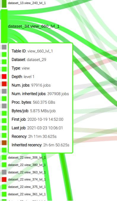
The team included a mouse over capability to display relevant metrics of a node, as you can see in the following screenshot:
The Conclusion
Making Science teams, acting as Data Custodians for some of our customers, have found is that conversations with Data Business Owners/Stewards regarding optimizations and housekeeping are greatly facilitated by the use of the BigQuery Intelligence tool. Sitting down with the Data Steward with data and visualizations in hand enables a transparent, data driven conversation. The value to the business from a tool such as BigQuery Intelligence comes in the form of improved performance for systems accessing/consuming the data and ensures a reduced GCP operating costs. The Making Science team members have feature additions already in the works and we will share some of the use cases and the corresponding benefits as they are available.